Below are samples of work that I created in response to a project called "Rhymes Revisited." The project was an illustration based one and looked at the themes of nursery rhymes to see how these could be explored to create interesting imagery.
The first nursery rhyme I had chosen to look at was Humpty Dumpty and for my project, I decided to have a modern day sub-theme to keep both the designs and the ideas fresh and contempory so that they would appeal more with the viewer.
The layered marker pen drawing shown above was a piece to show a thug/gangster like version of Humpty Dumpty as he is sat on his wall that he has just graffitied with his pin-striped suit, cane and hat and smoking his ciggarettes. The element of humour was always something I wanted to include in the project and this I think will further connect with the viewer, as there are rings on the outside of his gloves as well as the other things mentioned. The layered drawing also helps to convey the movement and the character that is the thug Humpty Dumpty, particularly the ciggarettes and the expression on his face.
Second Rhyme
When looking at the second nursery rhyme for which I chose "Three Blind Mice," I opted to lose the humour with this set of outcomes as I decided to record ways of communicating ways of almost showing a blind persons world through the mice characters and in turn create feelings of sympathy from the viewer and create awareness for the blind. This I feel will create another way for people to connect and come together when viewing the samples. The sketch below is a rough general concept of the three characters in a street scene and shows how they blend in with the background because of how blind people blend in and are an accepted part of society.
Outcome below-Ink Drawing. This piece looks at a different idea of how the meaning of the nursery rhyme is that Queen Mary killed three men for attempting to assassinate her and were said to be tied to poles and burnt to death. The smoke which covered their eyes is the reference of the three blind mice being blind.
The characters here in the drawing are seeking their revenge on Queen Mary, but there is also a reference to the nursery rhyme as the bottom mouse has had his trousers ripped on the seat and there is a scar for where the farmers wife had cut off their tails. The composition for this piece is what most interests me because of how the main mouse is almost the ring leader staring at Queen Mary whilst the other two mice deal the violence. The way in which as well that they blend into the background, the shadows and yet Queen Mary's shocked screaming face and the ringleaders calm and collected expression stand out, work well in communicating the above ideas, this design is one I am very pleased with as it turned out the way I intended.
Looking back at my previous pieces of work for the three blind mice rhyme, I felt the idea of creating sympathy for the blind was a more unique and interesting idea and so created another ink drawing that very much reflects on more how the mice and the blind would see the world in my eyes. The edges of the mices clothing weren't drawn in ink as this shows them blending in with the rest of society as I didnt want to lose that with them but yet also chose not to colour them in to make them stand out to keep the viewer awareness. The uses of blacks and greys I tried to use to create a sense of quick, frantic, busy movement and an almost psychedelic feel when studying the drawing because of the lines. this piece again turned out the way I visioned it, but unfortunately damaged a small area of the paper and so loses the overall proffesional take on an ink drawing, this though has been an insightful experience to be wary of water use on paper for any similar future outcomes.
Photogram Drawing
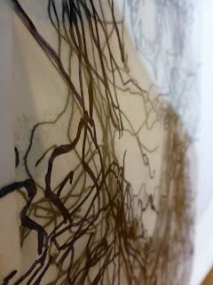
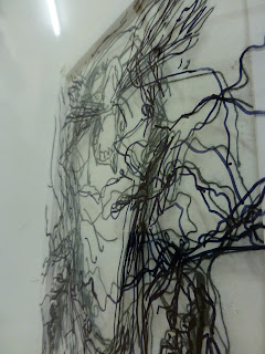
To further portray the concept of the way a blind person would see the world, the Photogram Drawings inspired by the artwork of Patrick O'Rourke were made as I thought that to draw on with just lines using marker on accetate and then develop this to make prints in the darkroom, the light would create a negative print, and so shows this idea more so than what a standard "positive" print would. The stencil shown above was first drawn and then developed in the darkrrom to create the prints below, the first one wasnt completely exposed and so created the white border which loses its overall presentation, so made another fully exposed print, also shown below.
Third Rhyme
Final Piece


No comments:
Post a Comment