The examples shown here are outcomes I have created for my first photography project to which the brief was called "Identity" and was about peoples identities and the photography techniques for which to record this idea.
As a strarting point I decided to create observations in the style of Sophie Calle and the detective like approach to her photography as the idea of creating natural shots of the public to show different types I initially found quite interesting. The two examples below are developments of these intial shots which were taken around the college campus and using settings on Photoshop created the images, the first one I like as the repeated patterns and shapes create an interesting sense of movement and the figure of myself in particular almost looks as if the spirit is rising and the thought of incorporating a supernatural element into my work I felt would create more eye-catching imagery and would go on the idea of identity in a different light.
The second outcome shown above looks more at the two figures and I opted to make them like silouettes as this would create the ghostly sense and also made me consider the possibilities behind hidden identity and how this would connect an audience as the viewer doesnt know who they are and in turn creates questions, this outcome I feel was successful for all of these reasons and is one I am overall pleased with.
To continue this idea of hidden identity I decided to look at Brightness and Contrast again and the emphasis of light and dark in this image I feel works well and the fact that the figure merges with the background adds to the supernatural appeal and feel for the viewer, brightness and contrast has almost become my favourite technique after creating this piece.
The image shown above was a further development of the previous image with reduced levels of contrast to create an almost black and white approach and this I think is a greater improvement as it goes towards the supernatural element with the shades of grey and almost creates an outcome that looks like the traditional methods of photography which appeals to me and is my preferred choice of photography. In the background there is another image of myself to create the idea of there being more than one person watching and the effect the light has to create this I feel works well.
Multiple Exposures
During the project I learnt the technique of Multiple Exposure Photography with a digital SLR and found that this would bode well with the Identity theme as the process captures several emotions and expressions and merges them into one complete image, this technique I found enjoyable and think that it shows human emotions in a way to which it wouldnt register with the viewer when in person.
The first self portrait shown here I am pleased with as the subject doesn't fill the entire image and so creates an interesting concept of half light and half dark, the dots of light on the piece as well I like and feel they add to the movement and almost ageing of the image and the idea of incorporating nostalgia would help improve the work visually.

 My reasons for including the two images above are that I particularly like the blurring effect that they have, this doesnt show good clarity with photography but I feel it creates a sense of warmth as well in the images, particularly the right hand piece and shows the emotion through people more, which relates well to the Identity theme. The left image is a self portrait that also has both an enlarger in the darkroom and also another section of myself from the multiple exposure showing through it and feel that these combine well together to create another image of myself within an image and this may be an interesting concept on "Identity" that I may pursue.
 Light Trails
The image above is one of my favourite multiple exposures as multiple exposure photography is all about catching the moments of time with repeat shutter use and also to show that people can change over time, these thoughts have only just come to me and so the clock used shows this.
The main reason for me using the clockface though was to experiment with props for more diverse images and to use everyday objects for the human face, so I saw this clock and the idea came and the combination of everything mentioned creates a unique slant on the identity theme.
Edits
The edit below was a development of emphasising the movement and the passage of time shown in multiple exposure and so is a simple cut and paste, but the several parts make the viewer look at each individual one and then see it as a whole which was the main purpose for this image.
My final multiple exposure edit was the image below as this is another cut and paste but saw the image and the fact it is half black, half white. This was then to become a black and white pattern sample but the interesting thing about the image is that it is the same image used but isnt exactly the same when you look at the left side and then the right as I wanted to show the differences in two panels.
Christoffer Relander Inspired
The responses above are outcomes inspired by the amazing work of Christoffer Relander. At this point I was exploring more of an idea of differnt emotions in people to portray the human identity. The left image is a more subtle one that responds less to Relander's and is a humourous touch of two faces, one frightened as to whether the figure is going to shoot the viewer on the barrel of his pretend gun, and the other staring cold.
Right hand piece was a direct representation in my eyes that shows the uneasy face moving as the person is suddenly snapping their fingers.
Text Portraits
Text became a factor to explore and the following images are a text portrait using small font, the font in which looks at the fear and imitation that the original portrait shot evokes (shown right.) Although it added an intersting sense to the portrait, it wasnt what I had in mind and so creating the second portrait when scrolled down to remove more of the features of the face and in turn show the fear and intimidation as there is less to see.
Piece below was made using the original image and experimenting with the brightness to create the orange hues.
Pushing The Brightness
Cameraless Photography- The cameraless photography pieces shown here are again looking at extreme emotions and so the variations of the self portrait show a distant feeling from the character which I like as it creates interesting points for the viewer.
There is a vertical mark up the side of the head slightly above where my hand is on these images, which came from the cameraless medium and looks to me like a ghost/ghoul character as it leaves the pretend gun!
Quite like this as its another humurous take for the work as I didn't want to get tied up in creating serious emotional states as this then can be quite upsetting to look at.
Some of these works as well just look at the interesting ways of distorting a human face and hands.
Overwhelming Light!
Overwhelming Light 2
The four images here almost look like a spirit is entering or leaving and so creates a supernatural twist that I mentioned earlier in this post. The different variations as well create different effects.
Water Reflection effect of hand.
With the idea of the supernatural related images came a sort of zombie horror emotion for which variations of this were also created.

Lava Lamp Hands
The edit below is a favourite and very much reminds me of album artwork for the Pendulum albums "In Silico," done by "Paul West at Form" and "Pendulum 3D Renders, Will Barker" with the colours and lines for which I love the album cover artwork and the music as well. The image also sort of looks like an image that is seen on nightvision or thermal imaging with the colours.
Variations on a filter are below from my cameraless photography image and I wanted to show the character move as he shoots himself with his pretend gun, so made the faces so that it shows the movement and the black around the finger is the bullet mark. Wanted to create these to create viewer sympathy and connect viewers with the idea of the characters emotion.
Photoshoot
For my identity based photoshoot, I decided to adopt the idea of a hidden identity and the idea of the Manchester Riots comes to mind as well and so makes us look at society and the supposed
"Lost Generation" that youths are branded as today, despite every generation being tagged as this.
"Lost Generation" that youths are branded as today, despite every generation being tagged as this.
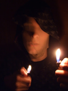
I also used the idea of masking my face to look like a traditional bank robber and the use of a lighter for lighting as I think it looks further at a hidden identity in a modern way. The lighter I felt could create just enough lighting to not show too much of the face as this creates the questions and different interpretations from different audiences and yet at the same time create warmth and light in my imagery which is something I like to incorporate in my work.
The main concept for this photoshoot though is the idea that the public have of people who wear hoodies are generally considered bad people, but who are they really?
The first image shown above I am really pleased with as this was one of the few images I had in my minds eye because of the composition but wasnt sure whether it could be created as all these images are all self portraits as I was interested by the idea of Self Portraiture and
Experimental Photography and the fact that the image was taken exactly right, by an unexperienced but yet willing family member, I found amazing and is one of my favourite photographs i've ever taken.
The skeleton like features on the portrait photo above make this shot more unusual because of the direction of light and the character "Bane" from Batman also comes to mind and so I feel make the image visually interesting.
The image below as well almost looks to me like a mannequins head and so disguises the appearance of someone, the aspect of it being quite small on the black background makes you study the portrait which I am pleased about as I didnt want the viewer to divert elsewhere when creating the portrait shots.
Another idea that sprung to mind was to use the light to show sections of the face rather than all of it, but knew that this would be difficult for me to position whilst the shot was being taken and the fact I achieved this the way I visualised, I am very happy with this shot.
Clarity in photographs was another area I wanted to cover as this would be a more photographic representation rather than a fine art/conceptual approach. The fact of the face above being the only thing visible I find intriguing and shows my idea of just the face in the portrait and nothing else.
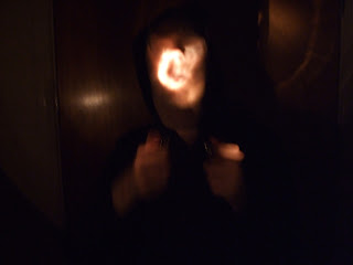
Image below was a study of the light trails from the light source and the repeat lines from the torch I think are what create this more eye catching photo, to which I was very surprised when looking back at this and also with the image following and how the light trails have reflected onto my eyes.
Lighting The Light
Another picture shown above that looks to have the face of a mannequin or a performing arts mask for which the light helped in emphasising this.
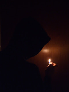
The cloaked portrait from behind was my other initial concept and I like the unerving feel that further emphasises the fact of who this person is really or who this person could be.
This looks like I have lit up a light bulb from wired Christmas lights just with my hands. The light source for this image wasnt even a bulb at all.
The image above was an edit from the first image from my photoshoot for which I edited to create the whites and blues and think this definately has a secret identity and yet visually interesting quality about it.
Further Photos- Hidden Identity
The self portrait photos shown below were in response to an idea that came to me of trying to only show certain parts of the face with a constants light source and show more facial expression in my work. Taken using my mobile phone and the light source being a Lego man torch that I have, the images I really like due to the shades of greys and blues that the images have and the black and white as well. The most interesting thing I feel works with this series is the pixalated almost grainy backgrounds as this is more unusual compared to solid black backgrounds and this is a factor for which I shall use in future works.
The facial expression created as well communicates the idea of the hidden identity and the question of who the character could be; the way I intended.
The facial expression created as well communicates the idea of the hidden identity and the question of who the character could be; the way I intended.
The image above was initially a motion blur photo and once taken, basic photo-editing software on my phone was used to distort the face. The distortion of the face is the main appeal here and how the eyes of the subject are not visible.
Images again showing the theme of hidden identity taken whilst on a night out and without editing. This time showing the whole face being black.
"Heads" B+W
Multiple Exposure
Supernatural effect using several heads/expressions.


.JPG)
.JPG)


No comments:
Post a Comment